Chart styles
Choose a chart's layout in Colours & Theme → Chart style in the poll editor. There are six styles. Each shows the same poll results, so changing the style does not change the question, voting rules or reveal timing.
The six styles
| Style | What it looks like | A useful starting point |
|---|---|---|
| Bold Flat (vertical bars) | Solid vertical bars with clear totals and labels. This is the default. | Short answers and straightforward comparisons. |
| Horizontal bars | One row per option, with labels beside the bars. | Longer answer labels that would be cramped beneath columns. |
| Editorial Grid | Vertical bars with gridlines and distinctive serif numerals. | A restrained look for a briefing or a discussion of the numbers. |
| Big Pop | Bold columns, labels above the chart and a pronounced shadow treatment. | An energetic workshop or an informal audience question. |
| Blocks (one tile per vote) | A growing group of small tiles for each option, with one tile representing a vote. | Making the number of votes tangible. |
| Rainbow | Coloured concentric arcs with a labelled key. | A more expressive result display when the choices are easy to distinguish. |
Rainbow is a chart style and also the name of a colour palette. The style controls the arcs; the palette controls the option colours. You can choose them separately.
Examples in a finished slide
These editor screenshots show Doppio charts combined with ordinary Google Slides text, photographs and graphics. The totals are preview examples, not audience votes.
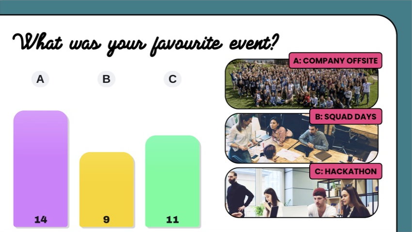
Big Pop with a picture key
This slide uses Big Pop, the Rainbow palette and A, B, C labels. The question and labelled photographs are native slide elements. Each letter on the chart matches a photograph, so the chart can stay compact. This example also uses Sequence only on phones; the slide supplies the meaning of each letter.
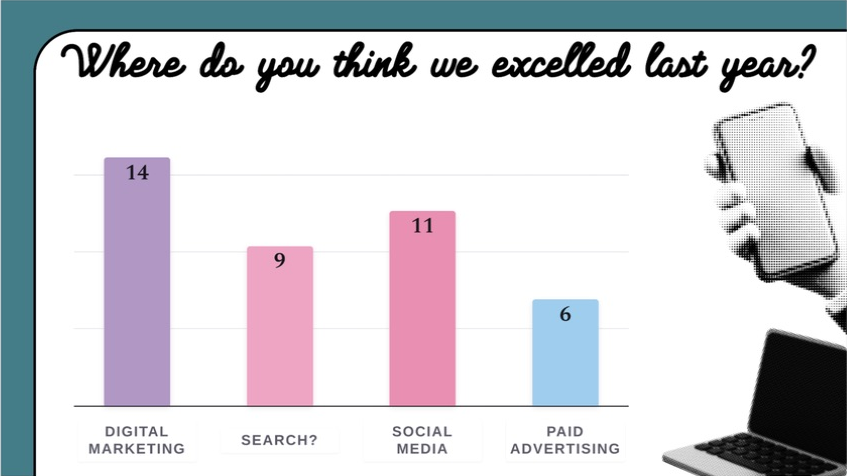
Editorial Grid with answer text
This slide uses Editorial Grid, the Ice Cream palette and Label each option. The full answer text appears below the bars, while the heading and surrounding imagery belong to the slide design.
Build a layout like these
- Create your heading and any photographs or shapes in Google Slides.
- Add and save a Doppio poll, then size and position its chart alongside those elements.
- Turn off Show Question if the native slide heading already asks the question.
- Choose option labels that work with the surrounding content. With letters or numbers, include a clear matching key.
- Match the chart background to the slide, or use Transparent in Colours & Theme.
For an illustrated introduction using Horizontal bars and Mermaid Lagoon, follow Your first poll, step by step.
Change a style
- Select the poll's slide and open Doppio.
- Expand Colours & Theme.
- Choose a Chart style and inspect the preview.
- Adjust the palette and background if needed.
- Check the question and option labels, then allow saving to finish.
For a new poll, click Save poll to add it to the slide. For an existing poll, changes save automatically.
Keep the result readable
Give long questions and labels enough space. Horizontal bars are a useful first choice for lengthy answers. If you use letters or numbers on the chart, make the corresponding choices clear elsewhere on the slide or on participants' phones.
The preview uses sample votes to demonstrate the layout. Inspect both the colours and the text, particularly when using a dark, transparent or custom background. A chart that looks balanced with three options may need more space with ten.
A results slide displays a source poll's chart. Change the source poll to change the styling of its results, rather than creating another voting question.